
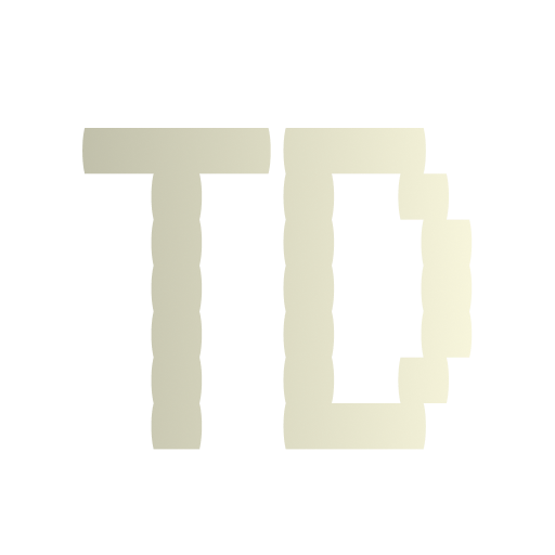

Grind is a bold logotype design created for a city café that caters to creatives, freelancers, and grinders — people who build things from scratch, one idea at a time. The logo embodies the spirit of focus, movement, and craft.
Context
Located in the heart of the city, Grind Café was envisioned as more than a coffee shop — it’s a workspace, a hangout, and a creative hub.
The brand needed a visual identity that speaks to its urban audience: young professionals, students, and creators who thrive on momentum.
Details
Timeline:
2 Day
Role:
Solo Designer
Involvement:
Concept development,mockup presentation
Goals
The main goal of this project was to design a logo that captures the essence of energy, hustle, and creativity — values that define the café and its audience. The identity needed to feel bold yet friendly, professional yet approachable. It also had to be scalable across various platforms, from storefront signage and merchandise to social media posts. Ultimately, the logo had to become a visual anchor for a space that inspires people to create, focus, and grind every day.
Challenge
The main challenge was to balance two contrasting elements: bold professionalism and casual creativity. The logo needed to be memorable and modern, yet accessible to a wide range of audiences.


Solution
To bring the brand to life, I started by exploring visual directions that could reflect both strength and creativity. I chose to develop a custom wordmark with a bold typographic structure, then paired it with an illustrative element to humanize the identity. This approach allowed the logo to speak to both the serious and playful sides of its audience, while remaining versatile across different mediums.
- Custom Typography: A thick, grounded typeface was crafted to express stability and clarity — making it easily recognizable.
- Mascot Illustration: A friendly character carrying a pencil adds warmth and creativity, reinforcing the café’s mission to support makers and doers.
- Versatile Application: The final logo was tested on signage, packaging, and digital previews to ensure it remained effective across all use cases.
Results
The final logo has been used across storefront signage, cups, merchandise, and social media. It helped the brand stand out in a saturated market and connect emotionally with its community. The visual direction has also inspired future brand assets and tone of voice.